Visualizing Streets Clustered by Address Layout
May 1, 2019
This post is a continuation of Clustering Address Reference Systems. After running a clustering algorithm, it’s always good to have a way of visually inspecting the clusters produced. I wanted to have an interactive plot of streets colored by their clusters assignments; where I could click on a street and its name would be displayed. You can find the notebook containing the cluster visualization code here.
Essentially, we want to plot streets with colors within any axis of our choice. There are 4 main steps to getting what we want:
- Get the axis of a bounding box.
- Get the names of streets within that bounding box.
- Get the polylines for those streets.
- Plot the polylines color-coded by their cluster assignments.
Before any of the steps listed above though, we need to load the data frame containing the cluster assignments generated by K-Means algorithm in the previous post.
1. Get the axis of a bounding box.
To accomplish this, we use OSMnx. OSMnx is a really neat python library for visualizing streets from Openstreetmap. It is easy to use, and all it takes is 2 lines to plot a street:
G = ox.graph_from_address('Prenzlauer Berg, Berlin, Germany', distance=1000)
fig, ax = ox.plot_graph(G, fig_height=10, fig_width=10, show=False, close=False, edge_color='#D3D3D3', node_edgecolor='#D3D3D3', node_size=25, node_zorder=3, node_color='w')
The polylines in step 4 below will be plotted over the axis of our OSMnx plot. This adds a nice touch of showing OSMnx network nodes.
2. Get the names of the streets streets within that bounding box.
To do this, we make a request to the Overpass API. The Overpass API allows you to query OSM data. Using Overpass turned out to be rather straightforward:
def fetch_streets_within_bbox(min_lat, min_lon, max_lat, max_lon):
  overpass_url = "http://overpass-api.de/api/interpreter"
  overpass_query = f"""
  [out:json];
  (
   way({min_lat},{min_lon},{max_lat},{max_lon})[highway][name];
  );
  out center;
  """
  response = requests.get(overpass_url,
                          params={'data': overpass_query})
  return response.json()
3. Get the polylines for those streets.
For that, we can use the polyline files generated by the good folks from Pelias. According to the creators of the polyline format, “Polyline encoding is a lossy compression algorithm that allows you to store a series of coordinates as a single string”. We download the polyline file for Berlin streets and parse it using this function:
def get_polylines():
  with open('./data/berlin.polylines', 'r') as f:
    polylines = {}
    lines = f.read().splitlines()
    for l in lines:
      val, key = l.split('\0')
      existing_line = polylines[key] if key in polylines else []
      existing_line.append(val)
      polylines[key] = existing_line

    return polylines
4. Plot the polylines colored by their cluster assignments.
Using the axis from step 1, we iterate through all the street polylines; plot them on the axis; and color them based on their cluster assignments.
%matplotlib notebook

text_x, _ = ax.get_xlim()
text_y, _ = ax.get_ylim()

text = ax.text(text_x, text_y, '', va='bottom', weight='bold')

plot_streets_within_axis(ax)

def on_plot_hover(event):
    for curve in ax.get_lines():
        if curve.contains(event)[0]:
            text.set_text(curve.get_gid())
            break

fig.canvas.mpl_connect('button_press_event', on_plot_hover)
To make the plot interactive, we specify the %matplotlib notebook magic command. The interactivity we want is to be able to click on any street in the plot and have its name displayed in the bottom left corner of the plot. It took me a while and the aid of some Stack Overflow answers to figure out this whole interactivity thing. At the end, we have an interactive plot that looks like this:
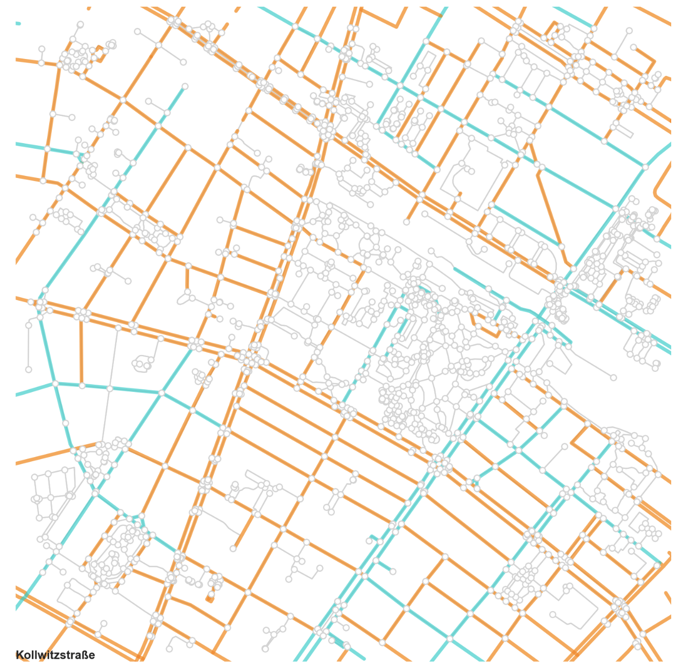
Streets in Prenzlauer Berg, Berlin Color-Coded by Address Layout
You can try out the notebook yourself.